Designing an app to help people effortlessly manage their finances
Jolt is a responsive banking app, designed as a case study for the UX Design Institute. A challenger bank that is new to the market, the brand is playful, yet places a strong emphasis on keeping things simple and clear.
Most banking these days is done online on our phones, yet many financial apps on the market are outdated and can be confusing to navigate.
People want a simple, secure app that they can easily use to transfer money and handle payments.
The Problem
Design a simple and secure banking app that users can easily navigate and manage their finances effortlessly.
Ensure that the design is responsive across all screen types.
The Solution
Timeline
November 2024 - January 2025
Role
UI Designer, UX Researcher
I acted as both UX and UI Designer on this project, which involved:
Conducting user research and identifying the main painpoints;
Creating wireframes and user flows;
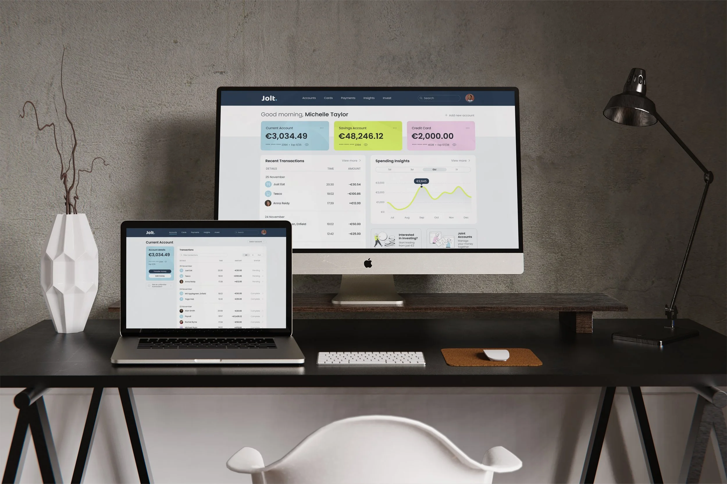
Designing and developing the necessary screens, and ensuring that they’re responsive across mobile, tablet and desktop;
Developing the final prototypes in Figma.
My Role
User Research
Identifying the painpoints
Keeping in mind the time constraints of the project, I conducted some informal interviews with family and friends, asking them about their experiences with the banking apps they currently use on a day-to-day basis.
Below are the main painpoints identified during the interviews.
User Flow
Exploring the journey from log in to making a transfer
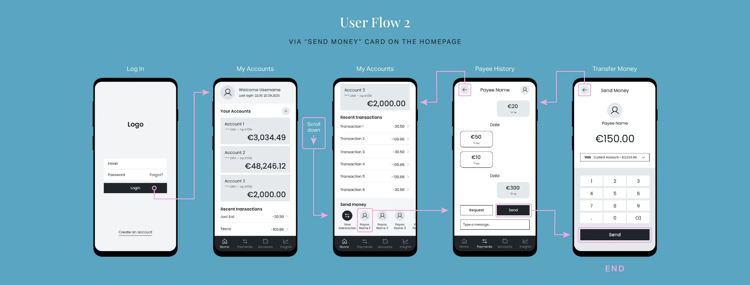
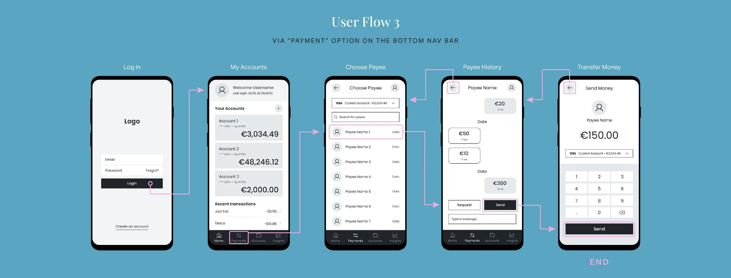
Focusing on the path a person would take to send money to a friend, I explored a few different user flows that addressed the main painpoints found in the research. I wanted to simplify the process as much as possible for the user, and to reduce the number of interactions they’d have to make in order to achieve their goal.
User Flow 2, as shown below, achieved the least amount of interaction needed - once logged in, the user would only have to quickly scroll down on the homepage to find the “Send Money” card, which would then bring them straight through the process of transferring money to a friend.
Wireframing
Putting function before form
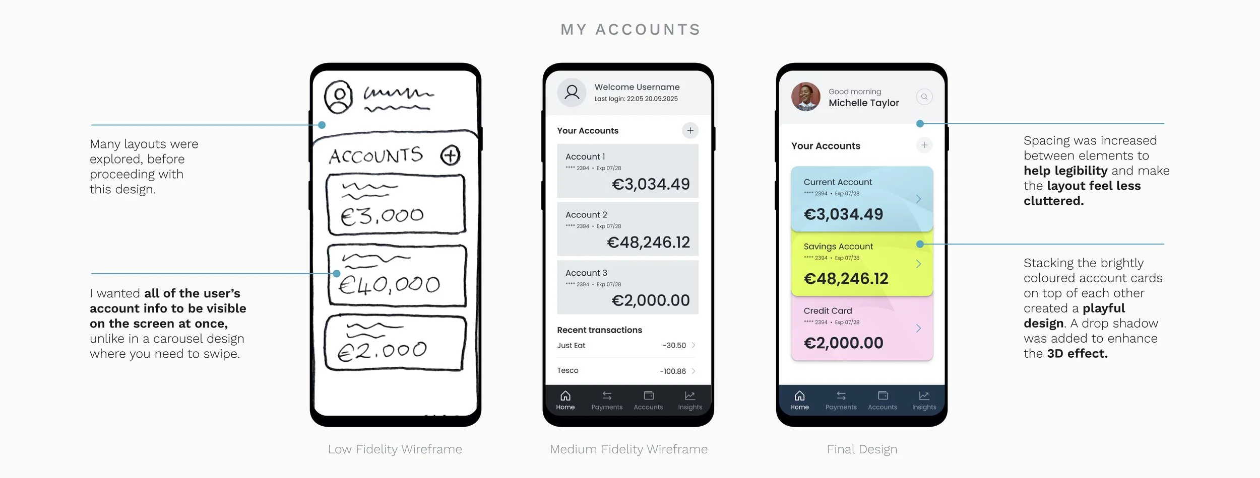
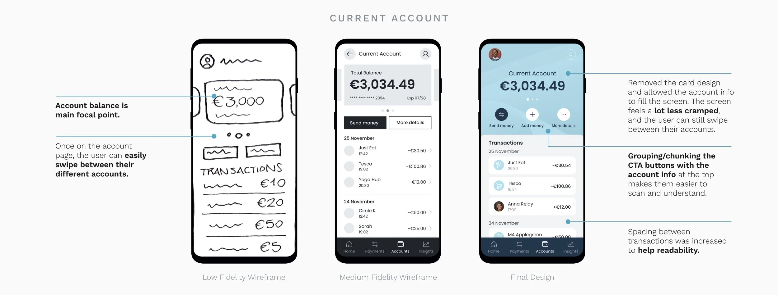
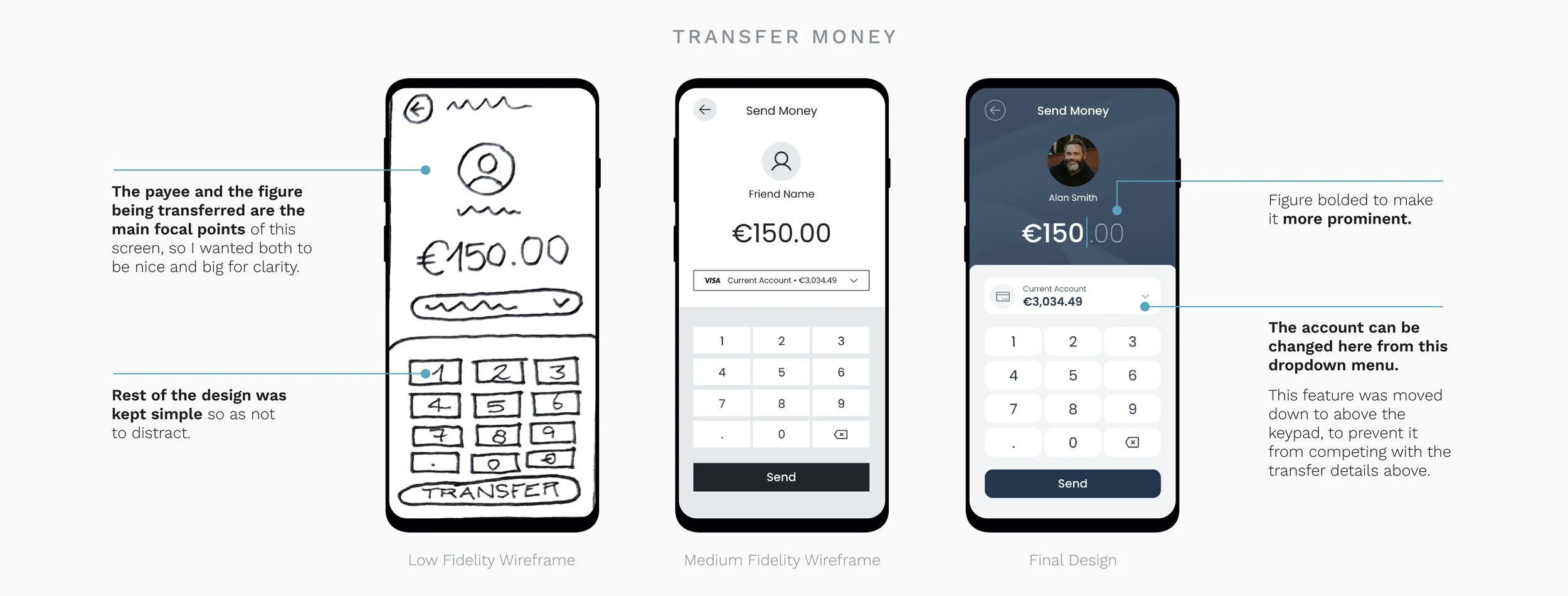
To get a clearer vision of the layout across various screens, I started off with a few sketches to explore the overall composition and refine the optimal user flow.
From these initial sketches, I developed a collection of medium-fidelity wireframes on Figma, keeping the color to a minimum to focus on the functionality, before finally integrating the branding and design.
Design Process
Development of the My Accounts screen across tablet and desktop
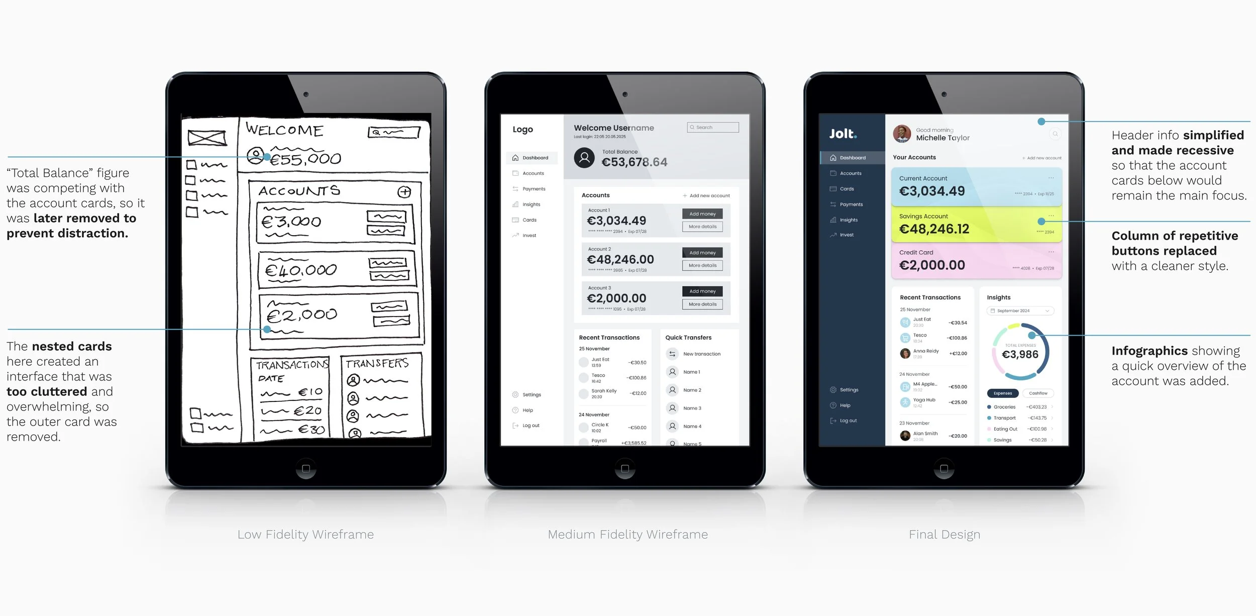
Focusing on just the My Account screen, you can see below how the design was tweaked and improved over time. I kept reiterating the layout, trying to make it as clean and simple as possible, while still retaining the important functions that a modern bank needs. Buttons were simplified, some distracting elements were removed, and the account cards were removed from their nesting.
Style Guide
Building the brand
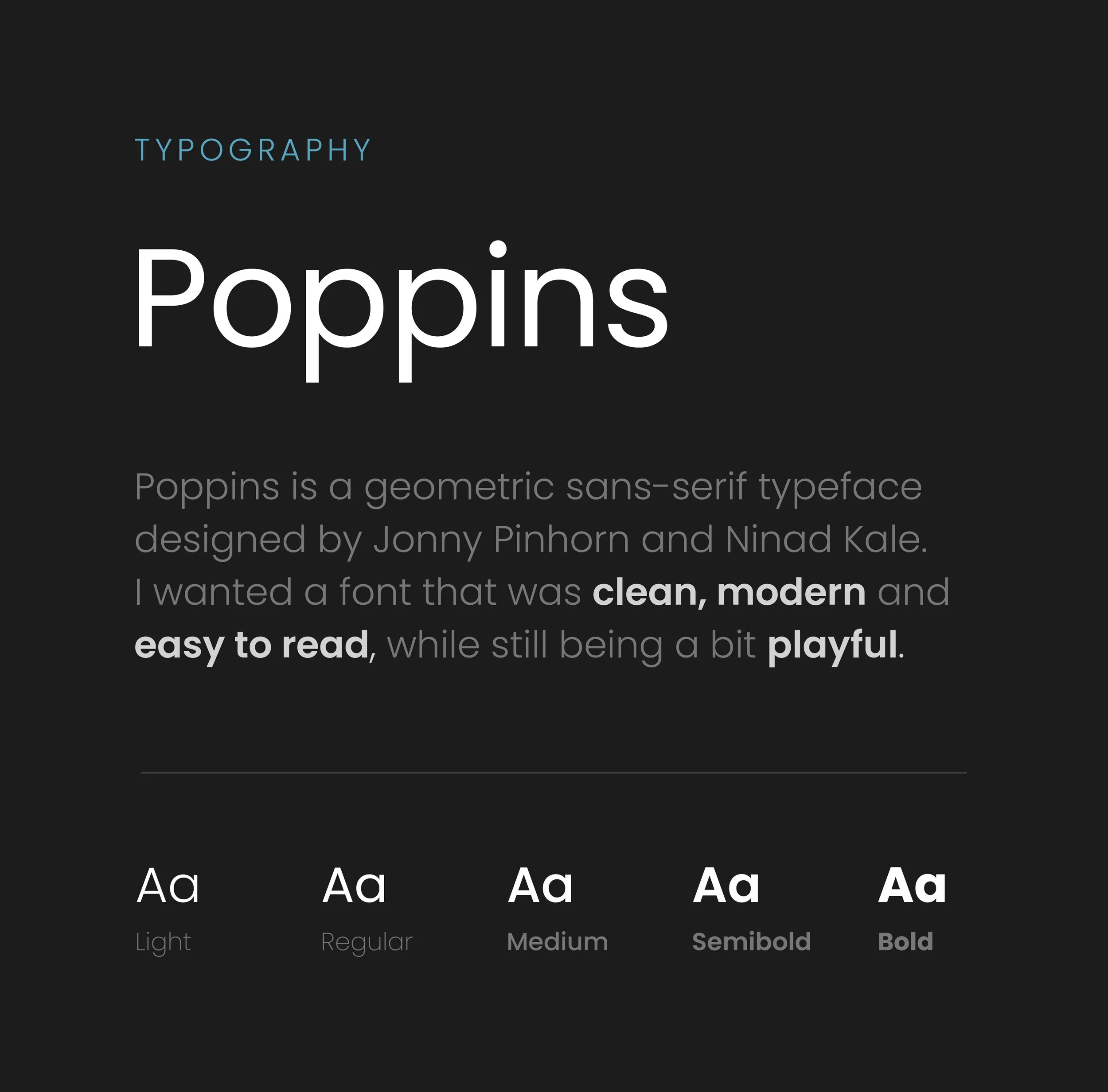
Jolt is designed for an audience who are seeking out a simple bank experience that they can trust. I focused on creating a design system that is clear, yet playful, an essential cornerstone of the brand. Poppins was a great fit for the brand, with its rounded and easy-to-read letters.
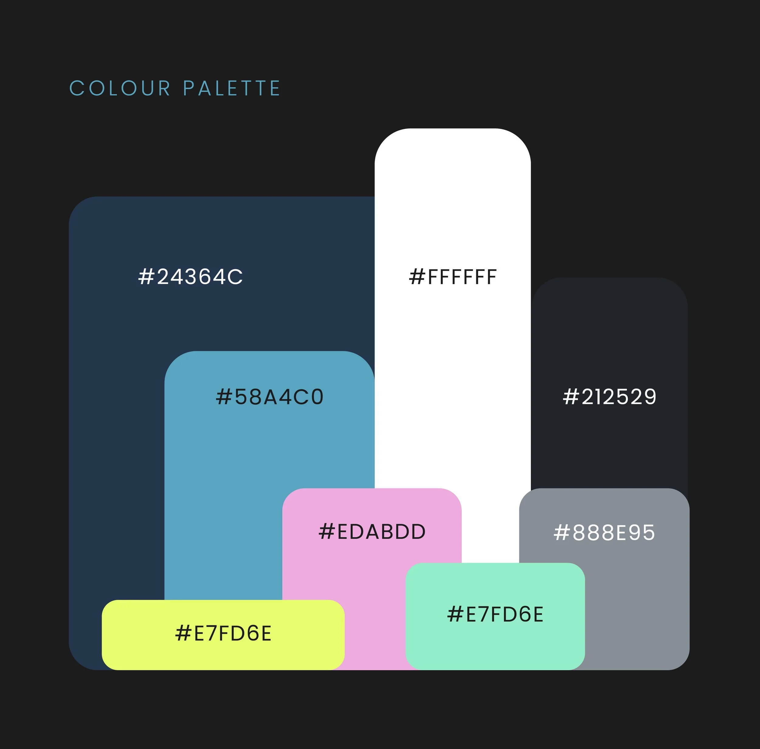
It was important to me that the app was accessible to all, so I explored and developed a colour palette that passes the WCAG 2.0 guidelines for contrast accessibility.
Blue is a common colour that is used in finance, evoking dependability and trustworthiness. By adding some brighter pops of colour to the palette alongside the blue, the playful personality of the brand could shine through.


In conclusion
What I’ve learnt
Designing Jolt was a highly enjoyable experience, one in which my UI skills were improved and refined. My curiosity was drawn in particular towards developing a product that was accessible to all and simple to use, which I’m happy I’ve achieved. I look forward to bringing my new skills forward with me into my next projects.


